Industrial office design ideas
Today’s industrial office design workplaces are more visually appealing, functional, and open than ever before. But in a world of cookie-cutter cubical designs, how did the industrial office aesthetic rise to prominence among leading companies like Twitter, Google, Redbull, and Capital One? The surprising answer: an art movement in post-World War II New York set the stage for a new approach to workplace design that influences how we work today in the 21st century.
Industrial Office Space: Revolt Against Office Cube Farms
Who ever thought cubicles were a good idea, you might ask. Well, they were a good idea, at least the beginning. When Herman Miller introduced the Action Office II line, created by designer Robert Probst in the late 1960s, it was held up as the office of the future — these revolutionary, fabric-covered cubicle designs were comfortable, spacious, and elegant in their time.
It wasn’t long, however, before knockoff designs appeared on the market. These allowed space planners, at the behest of finance managers, to cram more and more cubicles into smaller and smaller footprints — resulting in the derogatory nickname — cube farm — that we so often hear today.
What started out as an elegant solution had become a generic, dehumanizing punch line in Dilbert cartoons and movies like The Office.
Bottom line: by the late 1990s, there was a widespread revolt against working in cubicles, especially among younger, influential creative types.
Industrial Office Design: The Creative Alternative
The leading alternative design aesthetic for workplaces today is industrial or garage aestheticoffice design.
What is it exactly?
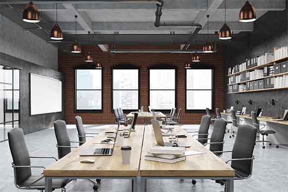
The quintessential workplace with an industrial-look has one or more of the following characteristics:
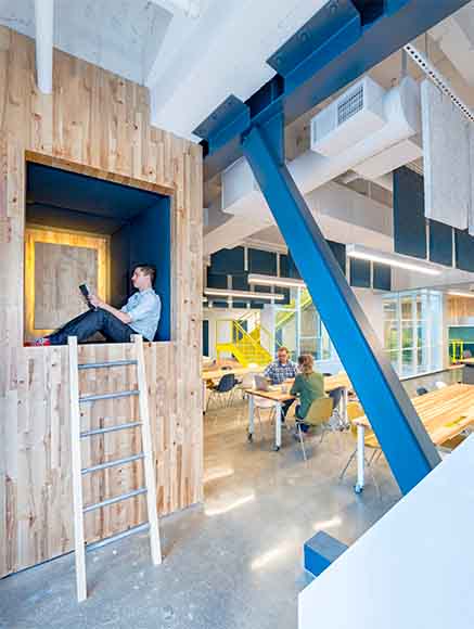
- Expansive multi-story lounge lobby areas with inviting seating for impromptu meetings. These open areas are contrasted with private meeting areas and offices that feature large clear or translucent glass panels to maintain the open work atmosphere.
- High ceilings, often with a narrow band of clerestory windows, or a saw-tooth roofline with glazed skylights. (Drop ceilings with fluorescent fixtures are a NO!)
- Industrial-age materials, such as clinker brick walls, exposed wooden joists and rafters, and heavy metal doors and fixtures. Typical floor choices include high-gloss finish hardwood floors — ideally refinished original floors or possibly distressed recycled alternatives — as well as polished, natural finish concrete floors.
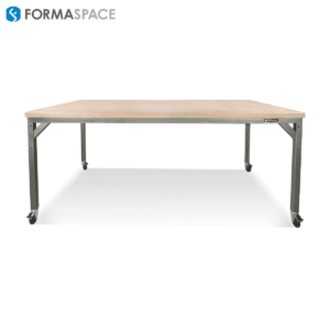
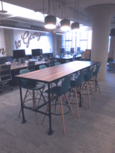
- Industrial furniture is an especially important part of this design aesthetic. Heavy-duty metal workstations and desks made of welded steel or stainless steel, and then treated with a protective clear coat that keeps the underlying metal and welds visible; topped with over-sized hardwood work surfaces, these industrial furniture pieces lend an authentic factory aesthetic to the office space environment.
- Exposed utilities, such as conduit tubes and duct work for HVAC suspended by cables from the ceiling, visible wall-mounted metal electrical conduits, and exposed plumbing lines mounted to interior walls and ceilings.
- Plasterboard (drywall) wall surfaces are often used to define different works zones; however, dividing walls may not extend all the way up to the ceiling, allowing air to circulate and enhancing the overall open space aesthetic.
- The smooth plasterboard surfaces are typically painted in solid, flat colors like white, gray or black to contrast with highly-textured brick walls or glossy hardwood floors. Graphic decorations are typically kept to a minimum, though they are sometimes punctuated by large supergraphics, such as corporate logos.
- Metal staircases are often styled after factory staircases or external fire escapes, typically fashioned out of welded steel plates or open grid metal grates. The stair rails, stair, and balcony guards are typically metal as well, sometimes fashioned out of combinations of welded metal tubes or cable stays.
- Bespoke lighting design is of particular importance as part of the industrial aesthetic. Whimsical designs, such as over-sized chandeliers crafted out of unexpected, up-cycled materials are popular; often using jewel-like details crafted out of bright metals, such as brass or polished aluminum.
How did We Arrive at the Industrial Office Design Aesthetic?
So how did leading companies like Twitter, Google and Capital One move from cubicle farms to a new design aesthetic that’s based on the industrial-look?
What’s the reason for the big shift? When and how did this come about?
Some might point to 1991, when the creative advertising agency Chiat/Day moved into their new headquarters in Venice, California.
Best known for their breakout advertisements for Apple Computer, Chiat/Day created the famous 1984 television commercial for Apple Computer, which featured a lone rebel woman rushing to the screen to smash the image of Big Brother.
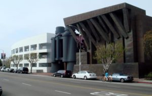
The new headquarters, designed by Frank Gehry, was a postmodern architecture masterpiece. The street front was punctuated by a three-story tall pair of binoculars, which inside housed impromptu, group meeting rooms. The building produced millions of dollars of free publicity for Chiat/Day and helped launch Frank Gehry’s rise to the pantheon of starchitects.
Postscript: Chiat/Day is now known as TBWAChiatDay, producers of the first television campaign for Twitter, another Formaspace tech client. However, TBWAChiatDay is no longer headquartered in the Binocular building in Venice. That honor goes to tech giant Google, another one of our industrial-look office furniture clients.
Postmodernism: Form Follows Function or Form Follows Fun?
As a postmodern icon of architectural design, the Chiat/Day building reintroduced a playful sense of fun that seemed to be missing from the modernist design movement, now represented by cubicles in the proverbial cube farm.
The tide had turned. While Mies van der Rohe, champion of the modernist international style, opined that “Less is More,” postmodernist architects like Robert Venturi promoted a new design aesthetic: “Less is a Bore.”
It was an exciting time for architecture and design. As the Memphis movement in product design from the 1980s merged with the Postmodern Movement in architecture, we saw an explosion in new visual forms, from architects like Philip Johnson and his Chippendale AT&T headquarters to Michael Graves, probably best known for his rooster teakettle designs which eventually reached the mass market at Target stores.
The Lofty Roots of the Industrial-Look
While postmodernism ushered in a new, playful sensibility in the corporate American design world, it doesn’t necessarily incorporate most of the key design characteristics found in the industrial-look design aesthetic.
For these design elements, like exposed brick walls, exposed plumbing, high ceilings, concrete or hardwood floors, we have to go back further in time — all the way back to the loft scene that arose out of the postwar New York abstract expressionism movement.
Artists generally look for two things when choosing a place to settle down: inexpensive studio space and a convivial café society mix of fellow artists and enthusiastic patrons who can support their work.
World War II left the art scene in Paris, which had led the world between the wars, in tatters. The center of gravity for up-and-coming artists in the early postwar period was moving to New York City.
Here, artists like Jasper Johns, Robert Motherwell, Jackson Pollock, and Robert Rauschenberg led the abstract Expressionism art movement. Out of economic necessity, they moved their art studios into spacious, yet derelict and often apparently abandoned spaces in old cast-iron warehouse buildings — in neighborhoods like the East Village and south of Houston Street.
Artists weren’t the only ones moving to New York City warehouses during the 1950s. Attracted by the low rents, open spaces, and convenient locations of these brick warehouse buildings, this new generation of urban pioneers invented what we would now term a lifestyle concept: loft living.
As the 1950s rolled into the 1960s, and abstract Expressionism evolved into the pop art movement, the loft lifestyle of creative artists, designers, and architects living in New York City became a worldwide sensation — thanks to the breakout celebrity of NY artists like Andy Warhol, who produced works like his iconic Marilyn Monroe and Campbell’s soup can canvases at The Factory, the name of his loft studio.
Countless individuals fantasized that one day they too could have their very own combination live/work space in converted warehouse.
Renovated Live/Work Spaces Across the World
New York City established specific rules for loft living and began enforcing safety codes. These places became more acceptable as real estate investments.
As New York loft living went mainstream, rents for spaces south of Houston Street, now known as SoHo, began to climb. The Tribeca neighborhood was the next to develop.
As one area was developed and gentrified, the search was on for the next new hot area to discover and develop — a trend that continues to this day as artists are priced out of Brooklyn and are searching for new digs in Queens and the Bronx.
This trend expanded beyond New York City.
Historic Preservation and Re-purposing Old buildings
Recycling old buildings for new uses was not limited to New York. The preservation movement was gathering steam across the country.
In Boston, Faneuil Hall Market Place was a milestone reuse development. In Chicago, warehouses in an area dubbed Printer’s Row were rehabbed for combination residential and commercial use. In San Francisco, neighborhoods like Jackson Square were early examples of live/work spaces before South of Market (SOMA) became the hub of warehouse re-development.
As these downtown neighborhoods across the country and around the world began to be redeveloped, the scales started to tip. Tastes were changing.
Once scary, urban neighborhoods began to seem more and more attractive as a place to live and work. In contrast, the idea of driving to a suburban office park location to spend the day working in a windowless cube farm was becoming less and less attractive.
Mass media reinforced this idea. Television sitcoms began to feature hip young urban professionals living and working in renovated urban settings with classic industrial features, such as exposed brick walls, high ceilings, raw materials, etc.
You can turn on the television any day of the week to watch reruns of the television series Friends, which filmed many scenes in the eclectic, industrial coffee shop Central Perk — or reruns of the hit series Will&Grace, whose lead character Grace Adler manages her (fictional) design business in a converted loft in the famous Puck Building in lower Manhattan.
The Industrial-Look: From Artist Movement to Modern Office
So that’s the short version of the history of the industrial-look: from artists in New York City looking for inexpensive studio space to the headquarters of today’s leading companies like Google, Twitter, and Capital One.
Are you looking for ideas on how to create your own industrial office look?
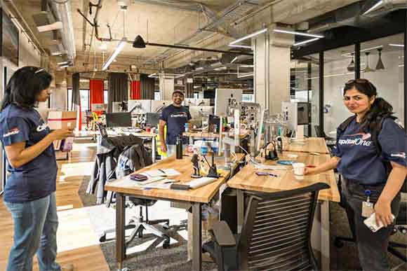
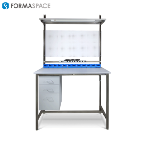
Formaspace computer workstations and sit-to-stand desks are the genuine articles. Our furniture doesn’t just look industrial; it is industrial: we build furniture for manufacturing facilities at Apple and Dell Computer, Boeing and Toyota. We also supply furniture to Amazon, Twitter, and beyond. Formaspace laboratory furniture is also used in leading laboratory research facilities like Abbot Laboratories, Quest Diagnostics, Ariosa a Roche Company, and more.
We’ve touched on some of the key design elements for the industrial office aesthetic, but there’s a lot more to explore.
Get the best industrial office design with Formaspace
Contact us for more ideas on how to create the ideal workplace environments for your company.


